[Re-Branding]
|
[Old Logo]
|
[New Logo]
|
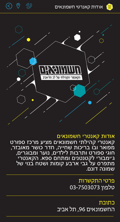
During 2019 I have had got a call from a new client
"Cauntry H'ashmonaim" for a re-new branding
The logo on the left is the old logo and on the right side
is my new design for the logo
I have change the old font that gave me a vibe of cream and not gym
it was more childish style and I had wanted to redesign it with a wellness clean style
I have kept the yellow color from the interior design of the space
and give it energy bust to be more fresh and live
And the Last twist in the logo is the letter A in the middle which made of
a circle and a lines to remind a shape of a person in exercise
[Signup Courses App Design]
I design a new branded for the signup courses app
I have decided to give the dark mode color to control the background
The yellow color was to bright to a mobile screen
On the left side there is the old yellow design
On the right side there is my new design
I have decided to give the dark mode color to control the background
The yellow color was to bright to a mobile screen
On the left side there is the old yellow design
On the right side there is my new design
[Loading Screen]
Old generic image Vs. new branded logo
Old generic image Vs. new branded logo

|
|
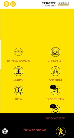
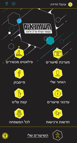
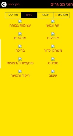
[Main Menu Screen]
Old small logo with generic icons Vs. Logo with branded icons and
Old small logo with generic icons Vs. Logo with branded icons and
|
|
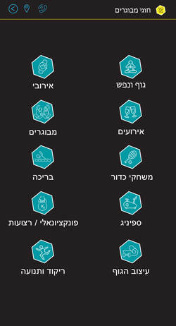
[Classes and Courses Screen]
Old broken menu with over information Vs. Simple clean branded icons for all classes
Old broken menu with over information Vs. Simple clean branded icons for all classes
|
|
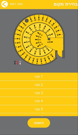
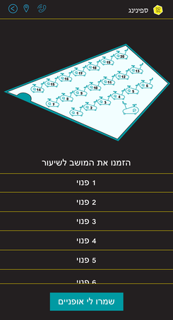
[Signup Class Screen]
Old mixed colour sign up page Vs. Simple and reality class space design
Old mixed colour sign up page Vs. Simple and reality class space design
|
|
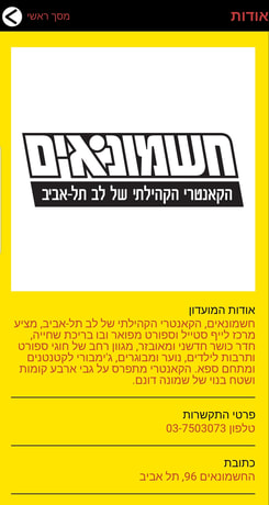
[About Screen]
Old red on yellow unreadable text Vs. Design branded page text
Old red on yellow unreadable text Vs. Design branded page text
|
|
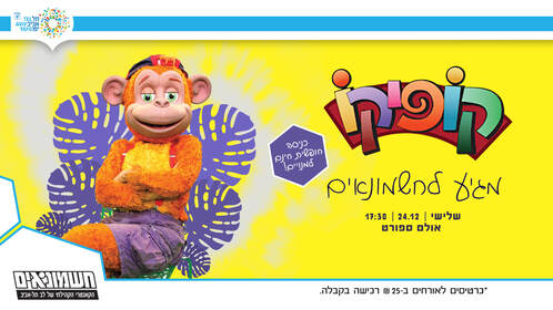
[Story Animation for 2nd Birthday]
[Lobby Screen Animation for Purim]
[Walking Day Invitation Animation]
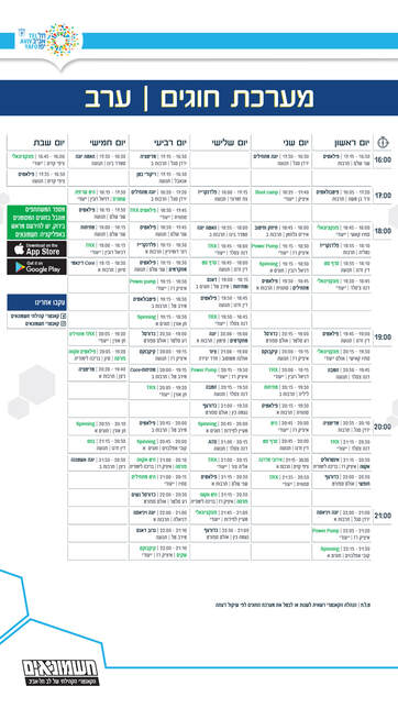
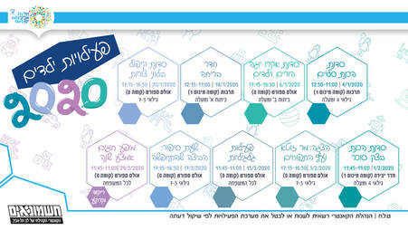
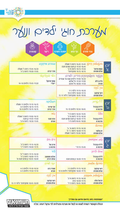
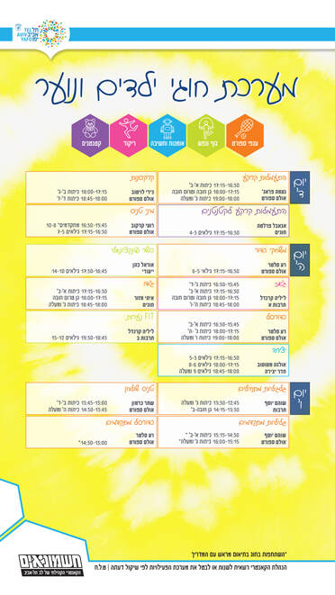
[Adults Schedule Classes]
|
|
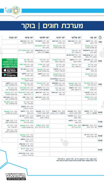
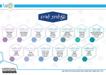
[Kids Schedule Classes & Activities]
|
|
|
|